
Do you like looking at covers as much as I do? Well I’ve collected some of them that I’ve come across so here’s 7 books to look at and to decide which one you like better:
Behind her Eyes by Sarah Pinborough


I definitely like the first one more. Maybe it’s the bit of colour that does it or the fact that her closed eyes make it all the more mysterious. Also, it matches the title better too in my opinion. The second one is the US cover and expresses fear to me whereas the first isn’t fear but more something she doesn’t want to see or something that is going on in her mind.. all options are open if I look at this one.
Blood Moon by John David Bethel


Definitely the first one again. The second one is too dark for me and doesn’t attract me so much, I’d rather have the horror house on my cover ;-).
Missing, presumed by Susie Steiner
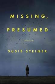
Difficult choice this one.. I get that desolate feeling with both covers but I think I’m going to go with the abandoned platform this time. It’s kind of funny because the Kindle edition is the second cover but there’s a person on the platform. I think it’s better this way though without anyone in it.
Local Girl Missing by Claire Douglas
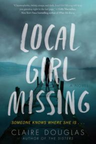

The second cover again. I like the flowers in rememberance of the girl.. it makes it just a little more interesting and real. The first cover doesn’t give any information and only really piques my interest with the tagline, not with the image.
The Girl On The Train by Paula Hawkins
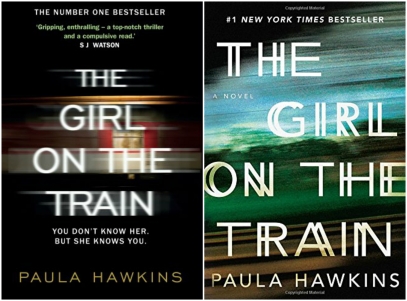
I especially didn’t include the film edition cover because I don’t like that one (with the face of the woman who’s playing Rachel on it). I get what they are trying to do here with these covers and although I don’t really particularly love either of them I’m going with the second one.. it’s the view from the train where the landscape is passing by in a blur and is the most original one I guess.
The Never List by Koethi Zan


I know which one I don’t like (the second one) but choosing the one I like most? Hmm, I’m going with the first one!
Death Note/Love You To Death by Caroline Mitchell


The third cover is the only one that you can still buy… I read the second cover of Love You to Death and I’m still going with that one, although I really like the first one with the heart in a knot too.
It’s actually kind of predictable which cover I’m going to like. It’s always the novel that I read and which I first came across. It feels like the novel is always attached in my mind to that cover and I don’t want to see it with another one. Crazy right :-).
So what do you think? Any opinions? I don’t mind at all if you don’t share my opinion so shoot away!

My only opinion is that I fail to see the point. And when they then also change the title for whatever reason, it just gets really confusing. One cover and one title, how hard can it be? 😄
LikeLiked by 2 people
I know it’s to do with territorial issues I guess. I especially hate it when the title changes! I’m happy it doesn’t happen too often.
LikeLiked by 1 person
What about when the whole dimensions and look of books change mid series… grrrr! Makes my bookcase angry 😐
LikeLiked by 2 people
Argh! There should be a law against that!!
LikeLiked by 1 person
For sure! Horrendous crime.
LikeLiked by 2 people
I know, why ?!!
LikeLiked by 1 person
Evil plans to force us to rebuy the set I say..
LikeLiked by 1 person
I did some posts like this about UK vs US book covers and Paperback Vs Hardback ones too. Most of the time, cover changes reeeallly annoy me!! My opinions on these covers are:
Behind Her Eyes – I prefer the 2nd one
Blood Moon – I prefer the 1st
Missing, Presumed – prefer 2nd
Local Girl Missing – prefer 1st (although I hated the book :P)
Girl on the Train – prefer 2nd
The Never List – prefer 3rd
Love You to Death – prefer 1st
Fun post Inge!! 😀
LikeLiked by 1 person
Cool, I think we mostly agree! Can’t believe you hated LGM, I thought it had a very nice plot twist 😉 Now that I think of the list, I loved all these books (still have to read Missing, Presumed though) except The Girl On The Train.
LikeLiked by 1 person
I found the characters way too annoying, I couldn’t even finish it haha! 🙂
I liked Missing, Presumed but it’s quite a slow paced thriller.
LikeLiked by 1 person
Okay, I’m on my phone so I have to look and then reply so there will be multiple comments, I apologize. Here are my picks.
Book 1: Cover 1
Book 2: Cover 1
Book 3: Cover 2
LikeLike
Those are exactly the ones I picked!
LikeLiked by 1 person
Book 4: Cover 1
Book 5: Neither. I refuse to read this book solely because the cover makes my eyes cross.
Book 6: Cover 1
LikeLiked by 1 person
Great choices and our opinions are very similar again. I can also recommend The Never List 😉
LikeLiked by 1 person
The last, I cant make up my mind but I think #3
LikeLiked by 1 person
Difficult choice this one for me too. Thank you Kristin!
LikeLiked by 1 person
Oo I love when you do these posts! I typically like US covers the least, which is funny since I live here. 🤣
LikeLiked by 1 person
Thanks. Strange.. there are so many US covers that I like though 🙂
LikeLiked by 1 person
You couldn’t be more on time with this!!!!! I’m working all day on a presentation about the same stories and their UK and French covers! 😀 When I thought blogging would be a nice break… Haha! The first cover for Behind Her Eyes wins for me while it’s the second for Blood Moon! I don’t like cover changes, but what’s worse is title changes! So confusing!
LikeLiked by 1 person
Ha! I think it’s easier to decide or really love one cover over the other when you’ve read the book.. then you really have that cover that in your mind fits the book most. That’s why I like Behind Her Eyes n°1 most too :-).
LikeLike
Great post! You should make this into a meme so we can all join in!
LikeLiked by 1 person
Sometimes you get different covers for audiobooks as well depending who published them.
LikeLiked by 1 person
Really I didn’t know about audiobooks, I thought they had one of the existing covers, not a new one!
LikeLiked by 1 person
I know I noticed this particularly with the CDs I get from the library as there are a few different publishes around.
LikeLiked by 1 person
That’s not a bad idea at all 🙂 It’s officially a meme :-)! I just saw these covers when I posted my review every time on Goodreads and I clearly had my preferences :-).
LikeLiked by 1 person
Yay I’ll join in this week then 🙂
LikeLiked by 1 person
I hate when books have different covers. Do you know how many times I have accidentally (before Goodreads organization) purchased the same book because of different covers! Makes me so angry. I don’t understand why they do that!!
LikeLiked by 1 person
Really? That hasn’t happened to me yet but I’ve had my doubts a few times and when I’m not sure I leave it. It’s the publishing rights for the cover that are different, I hate it as well 🙂
LikeLiked by 1 person
I really need to smarten up and just leave the book behind if I am not sure- lucky that I keep my Goodreads pretty updated so I haven’t run into that issue in a while!
LikeLiked by 1 person
I like when books have different covers because it represents how the designer in a different country pictured the book. I like a lot of the covers even though I find myself getting lost in the US ones but UK ones are also gorgeous! Book covers *_______*
LikeLiked by 1 person
They do and maybe some covers work better in some countries than others but still… I know you like the US cover of Behind Her Eyes ;-). I don’t really see them as US and UK covers though, I don’t even think which country they are from, I just see a cover and one I like more 🙂
LikeLiked by 1 person
1,2,2,1,1, 1, 1 ( I think we only agree on four of them, sorry!!!)I hate when they release a book with a cover that’s NOT as nice as the one on the arc and you feel awful saying: ‘look at this gorgeous cover-but that’s not the one you’re getting!’ Great post:)
LikeLiked by 1 person
Haha that’s ok! Yes you’re right, I can’t think of any right now but it is frustrating that the finished book is not as cool as the ARC!
LikeLiked by 1 person
Fun! I love comparing covers. I lile the first one better on all of these except for the Sarah Pinborough book. I actually favor the second one (which I have and still need to read) 😉
LikeLiked by 1 person
Me too, I love people watching and cover watching :-). You’ll have to read Behind Her Eyes first.. I didn’t think the overruling emotion was fear in that book but did get that from the cover, that’s why I chose the first one. If you’re like me though, you’ll stick with your first choice forever now 🙂
LikeLiked by 1 person
Haha. Now you have me very curious 😉 It is in the works this year. I loved her writing in 13 Minutes.
LikeLiked by 1 person
Good, and I’m planning to read 13 Minutes this year too 🙂
LikeLike
Enjoy 📚😊
LikeLiked by 1 person
I think we’re book cover twins because I picked the same cover for each single one! I tend to get attached to the book cover version I read as well, although there are some exceptions (especially when it comes to very different UK/US covers and availability where I live…) Such a fun post!
LikeLiked by 1 person
Really? Waw.. I love hearing that :-). Thank you Yvo!
LikeLiked by 1 person
We have similar opinions for all the covers apart from the last one. I think I like the first one with the knot though I am still undecided lol. The Girl on the Train covers are not so good in my opinion also even though the capture the concept. Great post.
LikeLiked by 1 person
Nice! I know what you mean, there is another cover though where they show the character sitting in the train and staring out of the window, it’s from the movie, but I don’t like that one so I didn’t add it 😉
LikeLike
This is a cool post and I think even though some of those probably aren’t translated to Estonian I am quite intrigued to go and check just to see what kind of covers they’re going for in the Eastern Bloc 😀
LikeLiked by 1 person
I wanted everyone to make a quick choice so I made it easy with just two (or three) choices but it should be interesting to compare even more covers :-). Thanks!
LikeLiked by 1 person
Yes! This meme could really blow up! 😀 In a good way of course… 😉
LikeLiked by 1 person
What a great post Inge!!!💙💛💚💖 I love your choices of the different covers! Just FANTASTIC and FUN!😄📚🎊
LikeLike
The second cover of Missing Presumed really stands out so much. I like that one best. Of all of them too. 😉
LikeLiked by 1 person
Ha, it so happens that it’s the cover I have in my library now (it has a person on the platform though). I haven’t read the novel yet but I hope it’s as good as the cover :-). Thank you for letting me know your fav!
LikeLiked by 1 person
I hate movie editions of books, personally hahah I do love seeing all the different cover arts though. It’s sometimes quite staggering how different they are from one region to the other. Excellent picks though, Inge! Keep ’em coming!! 😀
LikeLiked by 1 person
I don’t particularly love movie editions either :-). I wasn’t sure anybody would be interested in this kind of post but it looks like there are a lot of people like me who love looking at covers :-). Thanks for letting me know too, I think I’m going to do another post like this soon!
LikeLiked by 1 person
Pingback: Links I’ve Enjoyed This Week – Secret Library Book Blog
We are 100% compatible in our choice of covers! I agreed with all of your choices, even as to the ones you didn’t like.
Covers are my passion. See: https://fictionophile.wordpress.com/cover-love-series/
LikeLiked by 1 person
I remember your stone angels! You’ve got a great series, wow! I did one for hearts last year on Valentine’s Day too :-). I’m very happy to hear have the same cover love! Thank you!!
LikeLiked by 1 person
It’s crazy how much of a difference this makes, too! Like some of these I never would have given a second chance based on one cover, but would have picked up based on another! I hate when I realize stuff like that.
LikeLiked by 1 person
I know, if I really don’t like a cover – and it’s the first thing I see – then I probably won’t even read the blurb… Thank you for your comment lovely!
LikeLike
I absolutely LOVE this post!!!💖💖💖 I love seeing the different cover options for books and what not!📚💖📗💜📱💛
LikeLiked by 1 person
Ha, I’m going to do this one again this month and turn it into a monthly meme :-). I’m so glad you like my post.. wasn’t sure people would be interested in it :-). Turns out we DO like the same things 🙂
LikeLiked by 1 person
We do!!! Yay!🎊 I LOVE it girl and think it’s a great idea to use it as a monthly meme!
LikeLiked by 1 person
yeee, more !! I really like this.
for me; 1st, 1st also – I like the POV of that house with the moon standing over it, 2nd -more impact upon first impression I think, 1st – I like the girl standing on the warf … *cough*, eeeeeh imma pass that one…, I was going to see 2 but nvm … x) let’s go with 3!, and 1st one. I really like the rope shape in a heart
LikeLiked by 1 person
Lots of common choices! I like the rope shape too and the cover beside it because that’s the cover I received the e-ARC with and it’s kind of first love you know… Thank you again!
LikeLiked by 1 person
Behind her eyes first one
LikeLike
Blue moon and missing second one
LikeLike
Local girl missing the second one as the bold headline Every town has it’s secretes captures my attebtion
LikeLike
Girl on train I think my copy was first one and that is what I like best.
LikeLike
The never list, the second one. Like the image of looking through key hole.
LikeLike