
I’m back with 5 new book covers for you to pick and choose your favorite one. This is just for fun so there are no wrong answers! OK, I’ll go first:
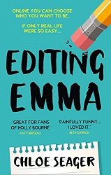
Editing Emma by Chloe Seager
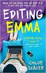
I pick cover 1. There’s just a little more flow on that cover.
The Guilty One by Lisa Ballantyne
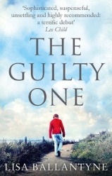
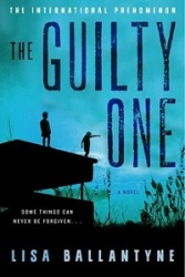
I choose cover number 2. Difficult to explain why I’m more attracted to that one, maybe because there are children on the cover and it looks like a dangerous situation?
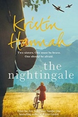
The Nightingale by Kristin Hannah
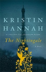
Definitely cover 1.
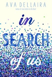
In Search Of Us by Ava Dellaira
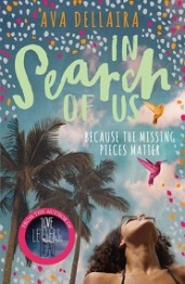
Cover 2. I read that novel as well and I’m really fond of all the colors on the cover. I feel like I’m looking at a true summer beach read.
Portraits of the Dead by John Nicholl
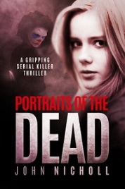
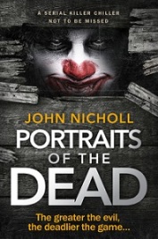
Cover 1. Maybe it’s also because I read this version too but the second one really is too creepy for me. I really like how they redid all the other covers in this detective series, except this one.

So that’s it. Tell me your thoughts! If you can’t get enough, check out Battle Of The Books #1 – #2 – #3 – #4 – #5 – #6

Reblogged this on Wonderwall and commented:
Answers to follow….
LikeLiked by 1 person
Thanks for the reblog 🙂
LikeLike
Bloody hell, that clown staring through the hole is truly traumatizing 😀
Apart from the Nightingale, all of them has at least a very similar style, so they look like part of a set or something. The Nightingale on the other hand looks like two completely different stories. Interesting.
LikeLiked by 1 person
Haha I absolutely love your analysis and you’re right that clown is just too scary :-). Thanks Norrie!
LikeLiked by 1 person
Editing Emma- 2
The Guilty One- 2
The Nightingale- 1
In Search Of Us- 2
Portraits of the Dead- 2
LikeLike
You’re going with the creepy clown cover, wow, nothing scares you 🙂 Thanks for the vote lovely!
LikeLiked by 1 person
I believe cover should be more creepy than the book itself. 😉 Look at that blurb, it’s perfect!
LikeLiked by 1 person
Yes I read it and it’s a great novel 😉
LikeLiked by 1 person
I was going to read that one with the creepy clown cover but I just couldn’t! Clowns don’t bother me as a rule but that one is just horrible!! I feel like it’s staring at me…
LikeLiked by 1 person
Haha I totally get that. It’s a great read really (I don’t know why the clown is so prominent). I read the novel with the first cover :-).
LikeLiked by 1 person
I think I’d select the same covers as you apart from the last one. I like being frightened (by fictional characters only, of course). Great Post Inge!
LikeLiked by 1 person
So you also do think it’s a rather frightening cover :-). Thank you Diana!
LikeLike
Beautiful cover’s 👌
LikeLiked by 1 person
Thank you.
LikeLike
Cover 1 for all of them. 😀
LikeLiked by 1 person
Thank you Ova!
LikeLike
Beautiful ❤
LikeLiked by 1 person
Second Emma cover looks so simple and perfect! I also love the second cover for The Guilty One, because it matches the title better. As for Kristin Hannah, I definitely prefer the first one. I love the simple, lack of detail in the first cover of In Search of Us. I don’t really like either cover for Portraits of the Dead, but I guess I’d choose the first one!
LikeLiked by 1 person
Ah thank you for making your choice! Your reasons are really clear too and I normally like simple covers most of all as well.. I guess these were exceptions 🙂
LikeLiked by 1 person
I agree with all of your choices but the second last one. I like the first cover because purple is my favourite colour ☺
LikeLiked by 1 person
Aaah of course, it’s amazing what a color can’t do :-). Thank you lovely!
LikeLiked by 1 person
Such great covers! I love both covers of The Nightingale by Kristin Hannah!
LikeLike
Thank you Nikola. You can never be disappointed then if you love both covers :-).
LikeLiked by 1 person
All the same choices except for In Search of Us Inge 😉
LikeLiked by 1 person
Thank you Sophie, I normally would go for the simplest cover too but I read this version of In Search of Us and the cover is relatable to the story, the hummingbirds, the vibe so that’s why I choose the vivid, colorful cover this time 🙂
LikeLike
I agreed with you today, LOL.
I think on the Guilty One, the second cover is so much more evocative of guilt. It feels like the left figure is judging the right figure, who might be about to go off the roof. I didn’t see them as children when I looked at it.
LikeLiked by 1 person
Oh waw that’s brilliant! Maybe you’re right and they’re not children.. I wonder where I got that from.. maybe something in the blurb.. Thank you for your vote!
LikeLiked by 1 person
Going to go ahead and agree with you this week. Especially on Portraits of the Dead. I do not do clowns 😂 no way, no how.
LikeLiked by 1 person
Wonderful :-). Well there’s a clown on the first cover too of Portraits of the Dead, but luckily it’s not the main focus 🙂
LikeLiked by 1 person
He is in the background though and not all up in my face haha. Although no less creepy
LikeLiked by 1 person
Are these different editions from the same country just at different dates or from different countries – just trying to work out why they are so different
LikeLiked by 1 person
They are covers from different publishers. I guess it’ll have to do something with country rights so I think they’ll be for different markets (European, US etc) but I can’t see on Goodreads (my source) for which country they are destined. It happens a lot though that there are different covers (not only for format but they also differ in the same format), and I like seeing them. A cover can do a lot!
LikeLike
Its the ones for different markets that always interest me – as if they are saying we are so different that we related to artwork in vastly different ways
LikeLiked by 1 person
Hmm I don’t know the discussion is really that we like different artwork, I think they simple can’t use the same artwork for a book with different rights and they have to negotiate everything over again with a different publisher. If you look at the answers and the agreement I get from other bloggers I’m not sure we experience them differently. I think it really depends on the individual. They don’t alway have a choice but to have another cover, some covers really don’t need changing. And what about titles: There’s the UK ‘The Man Who Didn’t Call’ and the US ‘Ghosted’. Or another: ‘Baby Teeth’ and ‘Bad Apple’, same book, and for what reason is that?
LikeLike
That clown is really horrible!!
LikeLiked by 1 person
Haha yep, couldn’t agree more! Thanks Nicki!
LikeLiked by 1 person
Great picks! I agree with the first three, and prefer the other in the last two… Number four is me loving anything blue and I’m always a sucker for simple covers with fonts and simple illustrations. The last one was tricky, but I actually like that the clown makes the cover scary haha.
LikeLiked by 1 person
Thank you Yvo. That last one has the most divided opinions I believe, interesting to see who’s scared of it and who isn’t. Doesn’t surprise me that you like it :-)!
LikeLiked by 1 person
Haha I do like my creepy covers… Although I’m not sure if I would leave it lying on my bedside table at night. 😉
LikeLiked by 1 person
Oh gosh I think I agreed with all of your choices… that cover 2 for Portraits is waaaaaaay to freaky!! Lol
LikeLiked by 1 person
Hihi thank you Nina!!
LikeLiked by 1 person
That clown cover is awful!! Agree with The Nightingale, unfortunately, I have number 2 xD
LikeLiked by 1 person
Ah but you already know it’s a great story and the cover doesn’t need to convince you anymore to buy it ;-).
LikeLiked by 1 person
I agree with you but the last one. Creepy clown 🤡 it is for me he he. It reminds me King’s It, which I am rather fond of, 😂
Great book choices Inge. 😊
LikeLiked by 1 person
You’re absolutely right, it has a King vibe! I don’t read King though, also too scary, so probably why I didn’t appeal to me so much. Thank you Vera!
LikeLiked by 1 person
1, 1, 2, 1, 1. The books look so different with the cover changes and yes I’m not keen on the clown one.
LikeLiked by 1 person
Oh you’re choosing the vintage (for lack of a better word) cover of The Nightingale, interesting choice :-). Hihi no scary clown for you either, good to know I’m not alone!
LikeLiked by 1 person
I like all the #1’s except the Search and that last one is way to creeepy for sure!
LikeLiked by 1 person
Thank you Holly for your thoughts on these. Happy to see you agree with me on that last one!
LikeLiked by 1 person
For me, for an art point of view, I would go with: 1 / 2 / 2 / 2 / 1
LikeLiked by 1 person
Thank you for choosing the covers that appeal most to you. Interesting to see that even from an art point of view you don’t choose the creepy cover nr 2 for the last one 🙂
LikeLike
I think everyone who dislikes clowns will choose cover one over two! ☺️
LikeLiked by 1 person
Excellent post! I find both covers of The Portraits of the Dead creepy but the second one is absolutely terrifying. I’m OK with most of them either way but I do like the original The Nightingale. Thanks for posting! 🤗
LikeLike
I’m with you on that last one and on The Nightingale.. I mean, it’s even in the name.. night.. it should be dark in my opinion 🙂
LikeLike
The Nightingale is on my TBR – definitely cover 1!
LikeLiked by 1 person
Thank you Lindsay. It’s on my TBR too 🙂 I hope we’ll both enjoy it, I have a good feeling about it that we will 🙂
LikeLike
Pingback: Links I’ve Enjoyed This Week – Secret Library Book Blog
Thank you for linking back to me :-). It’s wonderful to make it on your list!
LikeLike
I’m always fascinated by the different covers and since my bookshelves are full of murders I’m really quite glad that publishers have moved away from the black covers on the whole – that said the second choice for Portraits of the Dead is horrific!
LikeLiked by 1 person
Hihi thanks Cleo and I’m happy there are so many diverse covers too! Since I saw Final Girls, a thriller with PINK on the cover, my fav colour but one I used to associate with romance and cuteness, I realised that anything can go!
LikeLiked by 1 person